BRIEF
Walley Bank is looking to expand on the UX research that has been conducted and complete the UI design of their website. As a UX team, we’ve researched the market’s need for a banking website that allows people to create savings accounts (that I called Buckets) that help them save for small and fun items, such as a new phone or sunglasses, and large items, such as a rent deposit.
PROCESS
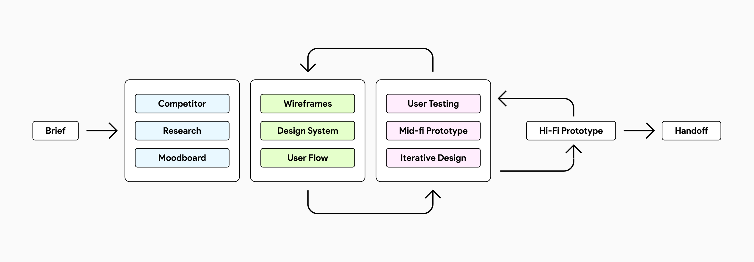
User interface design workflow is an iterative process where designers are involved in a lots of tasks in order to produce prototypes to be tested (and then realised). These activities consist (generally) in creating a moodboard, building a user flow, designing a design library system, drafting lo-fi wireframe, conducting user testing and produce hi-fi and interactive prototypes which will be delivered to the developer team.
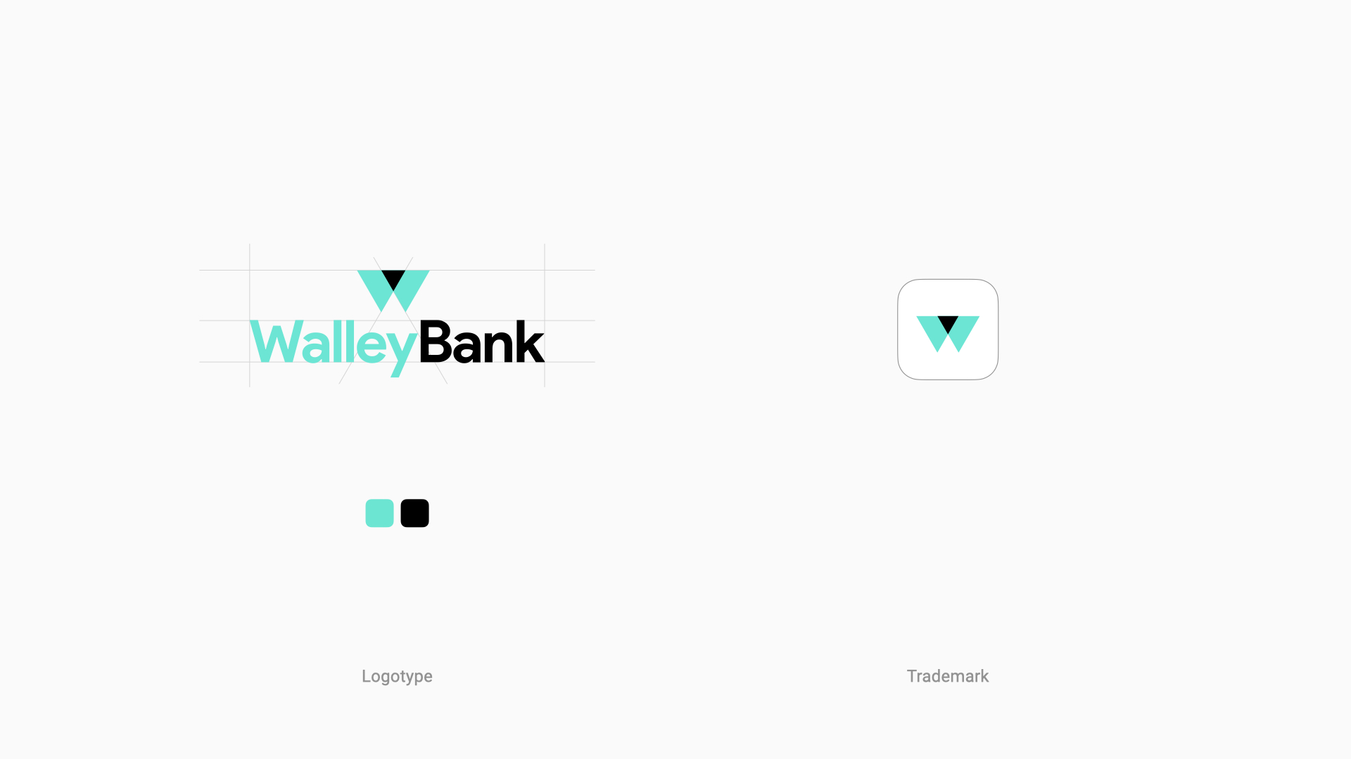
BRAND IMAGE
As part of the whole design system I started creating a logo. Walley Bank is a modern, smart and tech company, and so its brand. Colours and symbology will be part of the entire user experience.
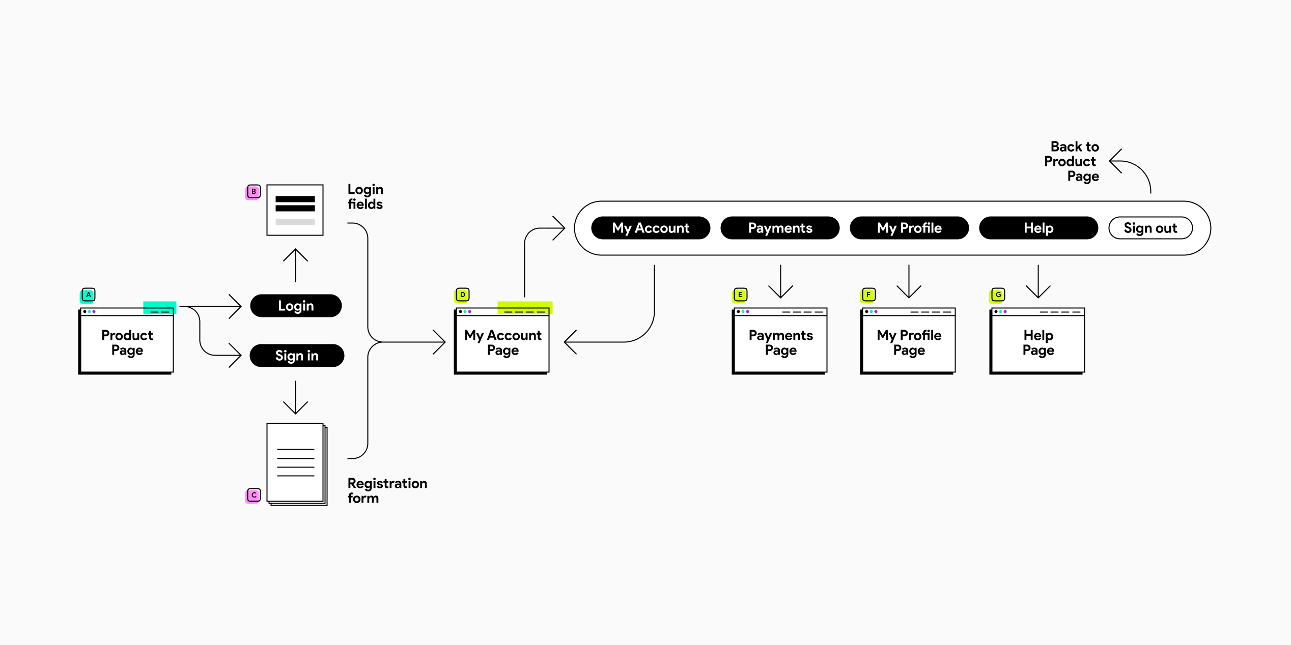
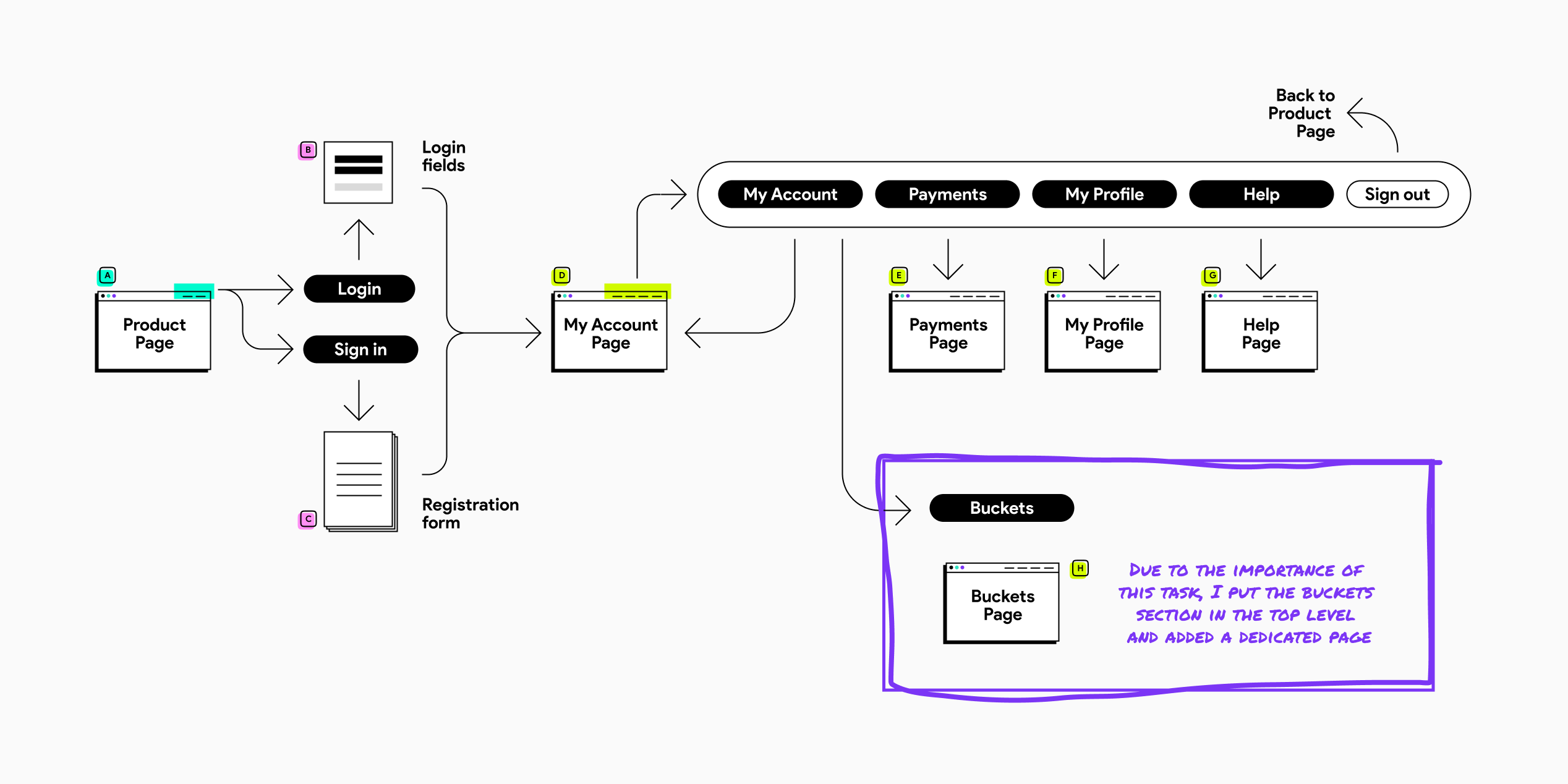
THE USER FLOW
The UI flow should reflect the requirements highlighted by the UX team. So, first, I tried to visualise what was the simplest path a user should take to achieve their goal and what content should be included. Then, I sketched the main menu and the flow through the pages. Finally, I worked with states and I tried to figure out how to make user’s life easier. Eventually, the result was a dynamic structure with all the main parts and all the states for each page.
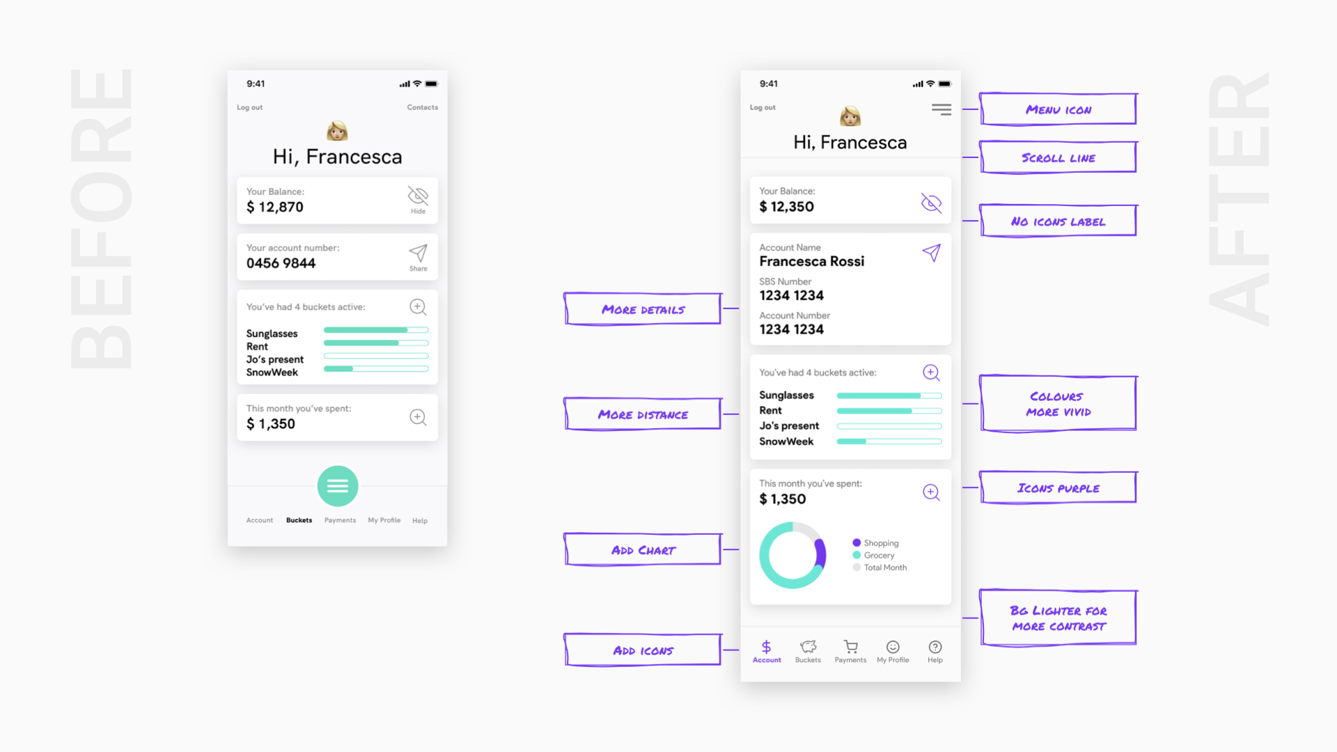
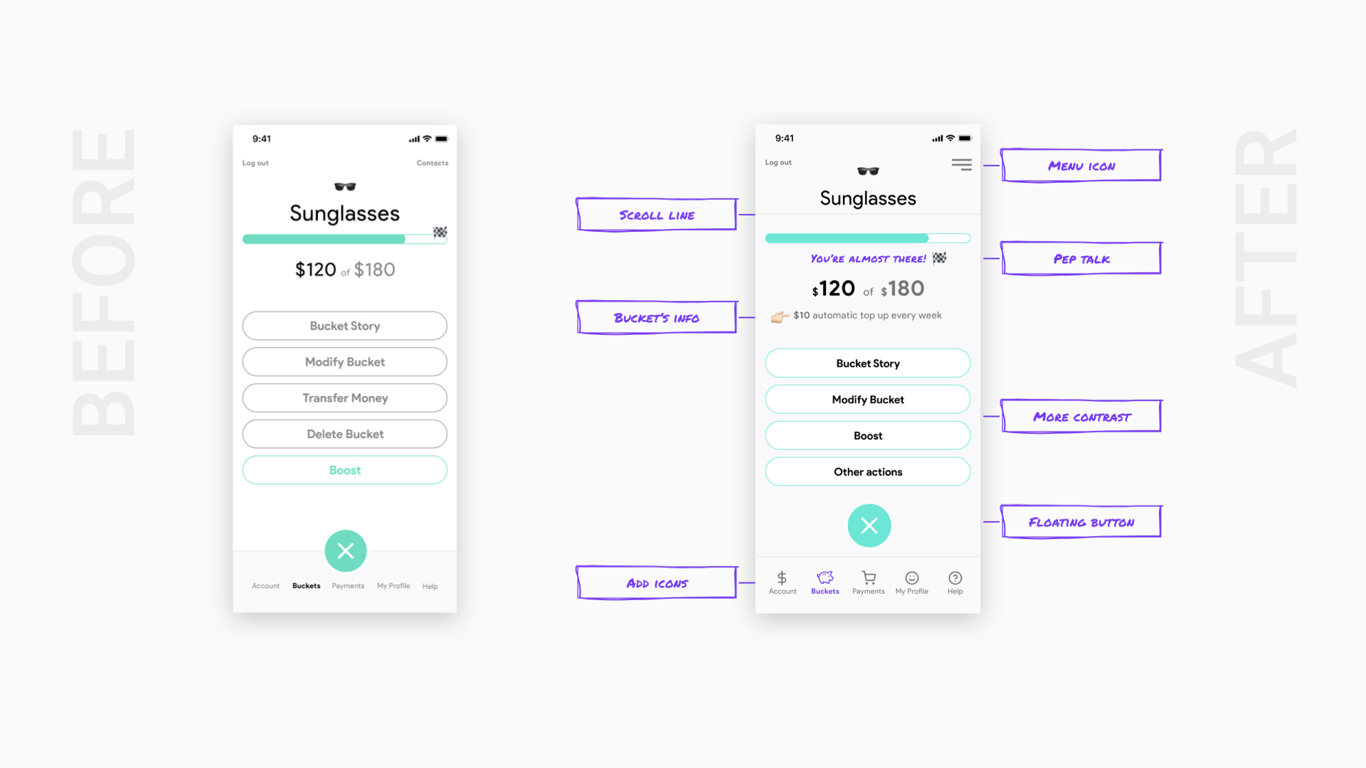
After some feedback and observations, as part of the iterative process, a few details have been revised and improved.
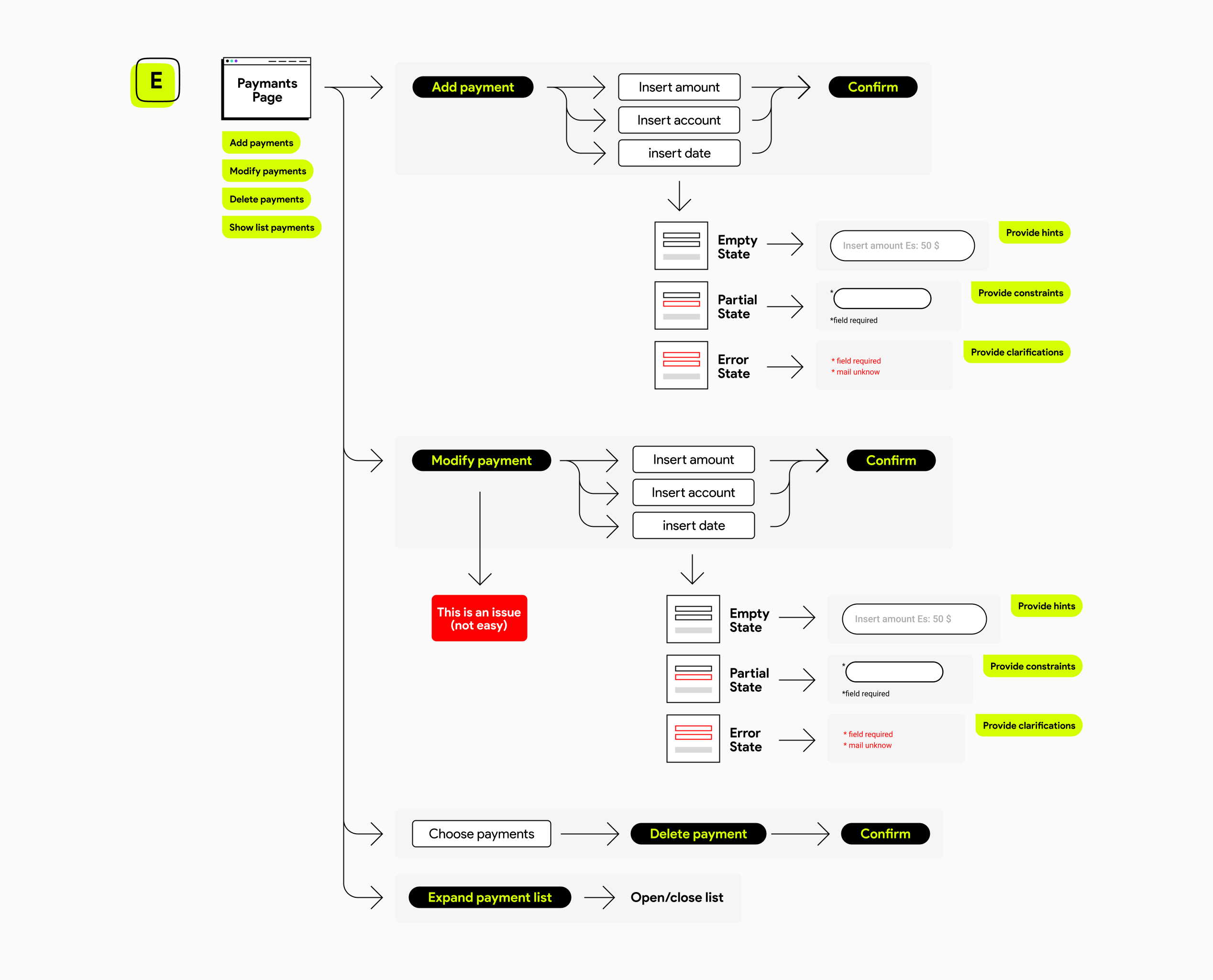
Then, I designed the user flow for each page (this is the example of the Payments Page) highlighting all the possible states.
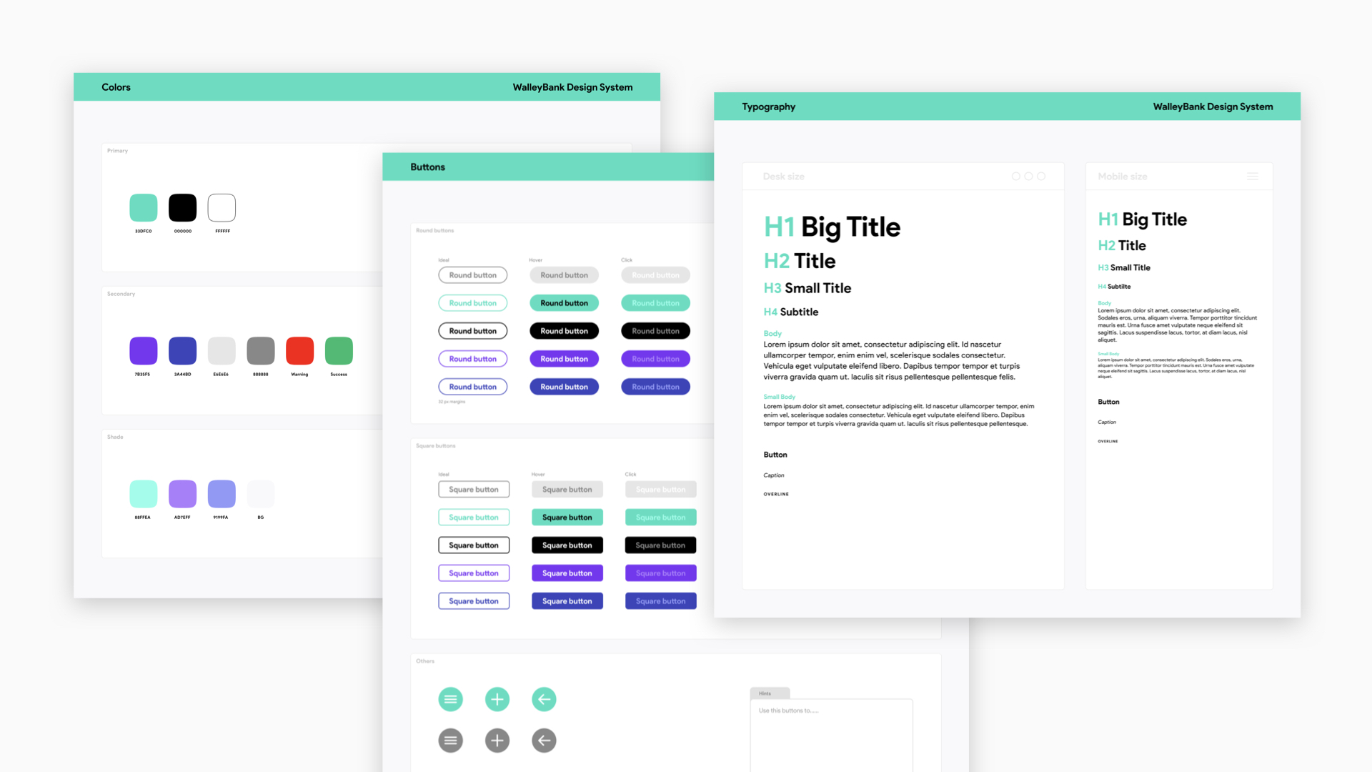
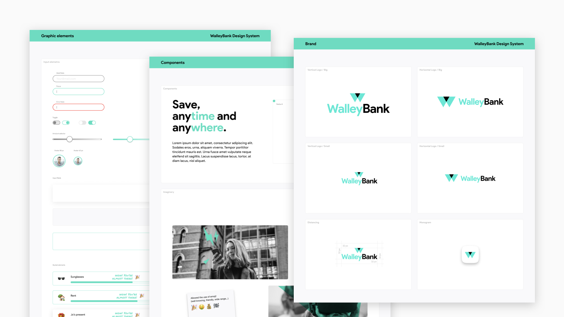
DESIGN LIBRARY SYSTEM
Walley Bank Design systems is an iterative framework including all the graphics and symbolic elements used in the realisation of all the pages to maintain consistency in all the phases of the design process.
Mid-Fi PAGES
After drawing mid-fi pages, I collected feedback and suggestions in order to keep improving the design and the usability.
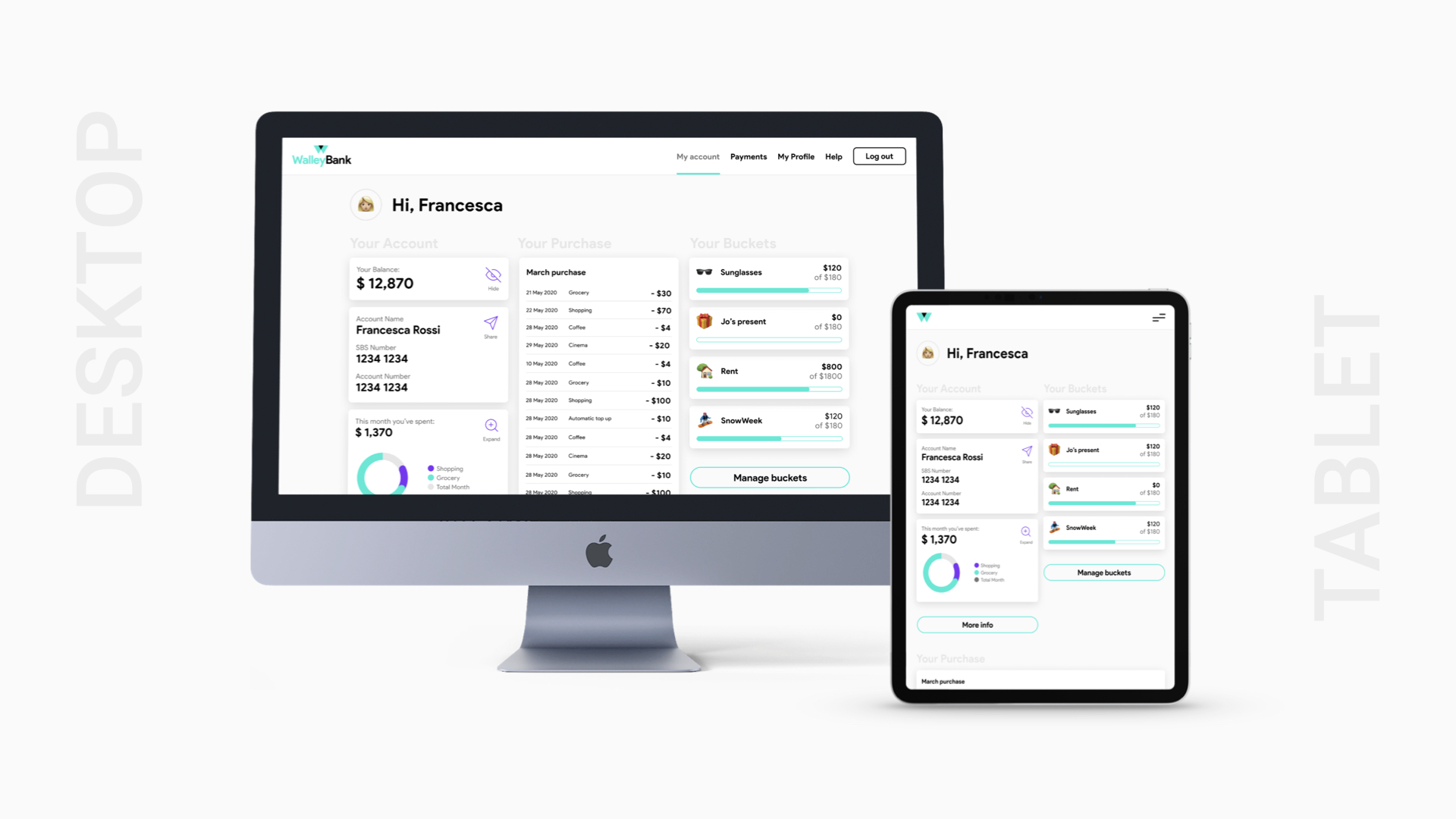
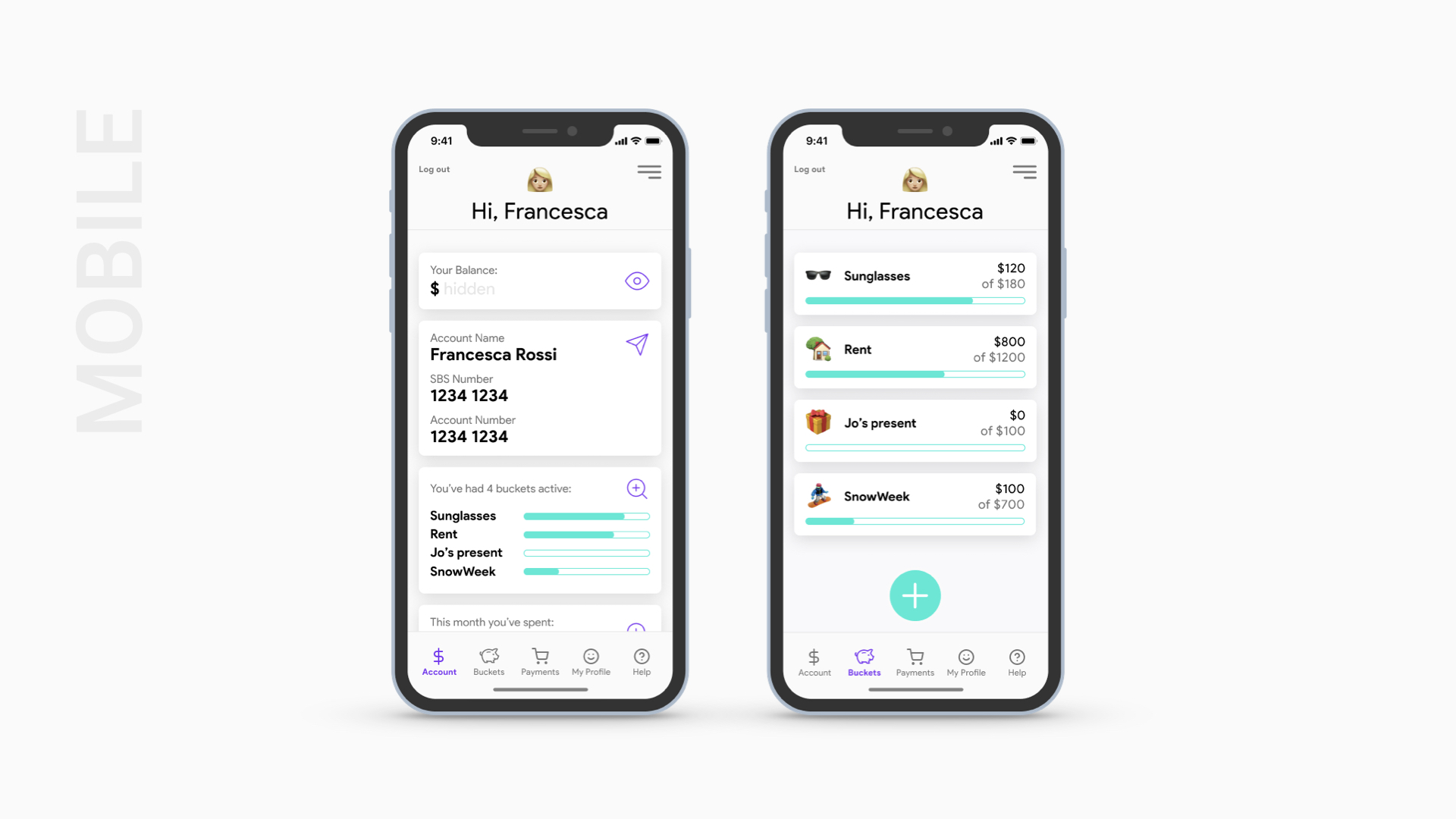
RESPONSIVE PAGES
A responsively designed website is able to smoothly change the layout to fit the screen size of the device that is displaying it while maintaining its own consistency.
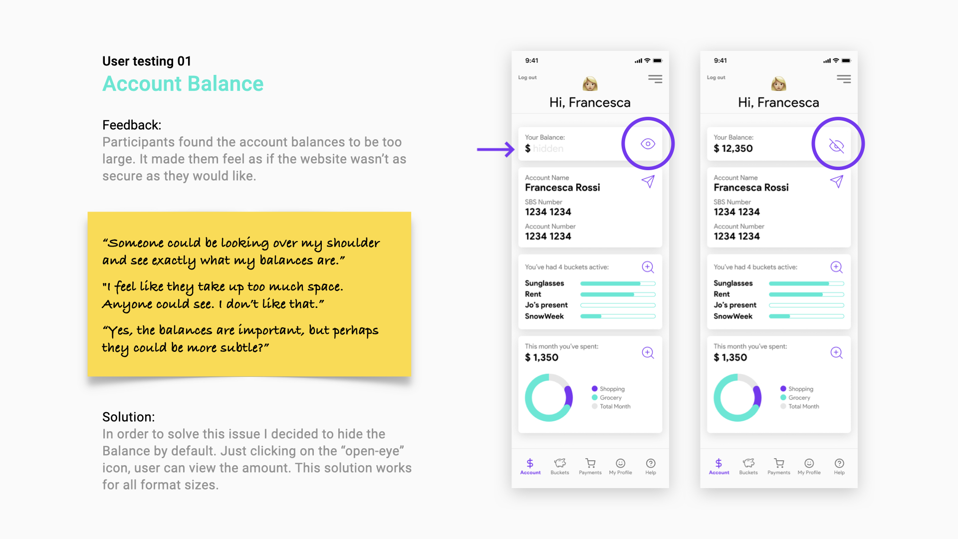
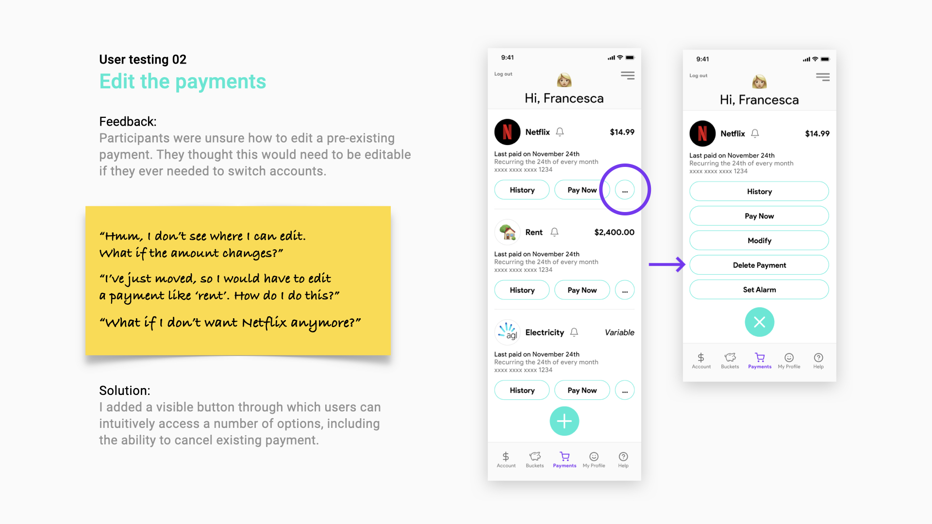
USER TESTING
I selected the three top insights found out from the first round of user testing. So, I tested these insights while I continued to iterate on the designs.
Insight 01: “The account balances are too large”
Insight 02: “Unable to edit the payments”
Insight 03: “Unable to view transactions for savings accounts”
PROTOTYPE
After the user testing, the feedback and the observations, I prototyped each main site’s section, going through the following specific path.
Prototype 01
Menu Navigation
User navigates through the principal site’s sections (My account, open/close Menu, Buckets, Payments, My profile, Help).
Prototype 02
Login
User logins to enter their account page. This prototype includes all the states (ideal, empty, partial, error, loading).
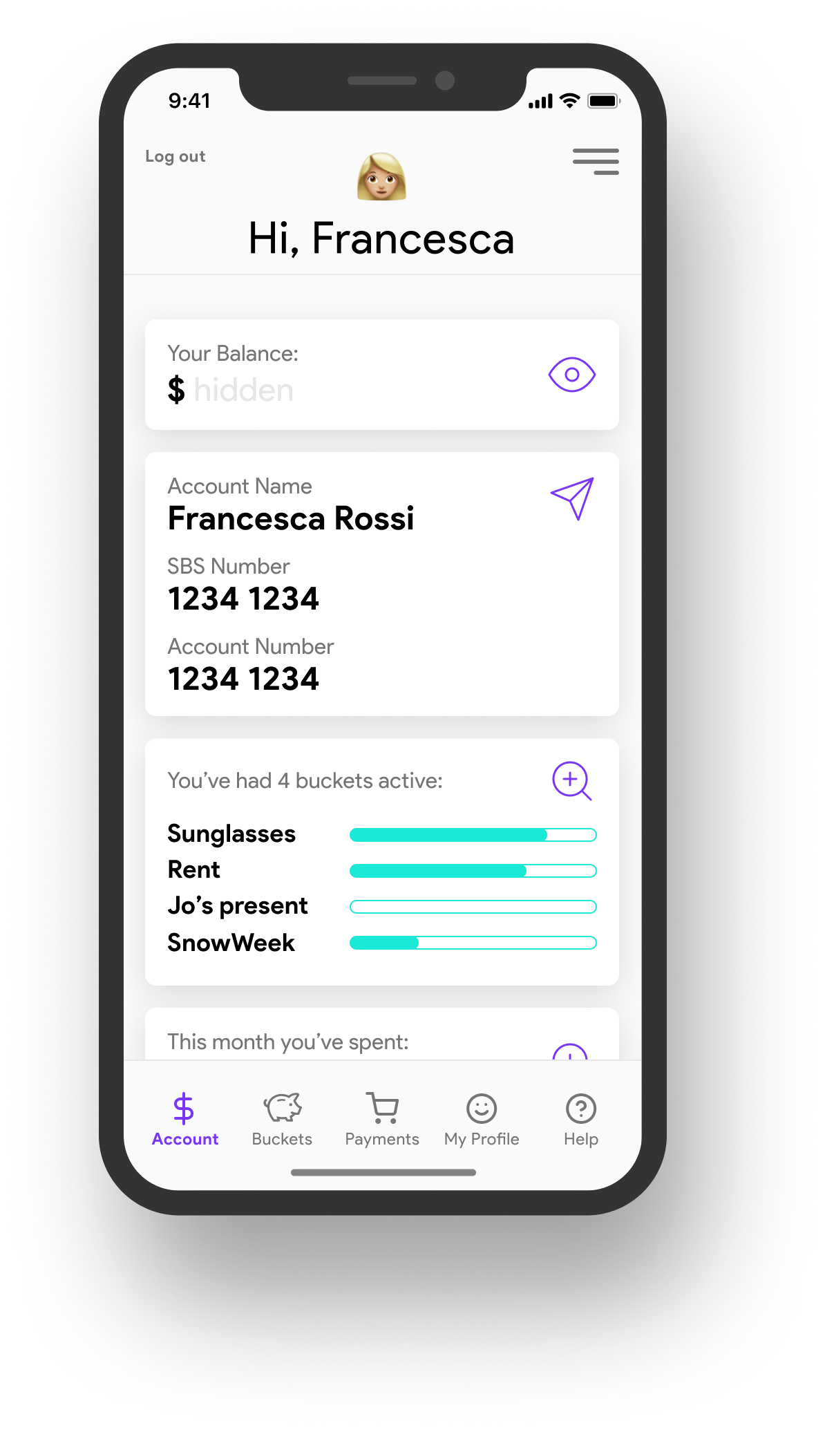
Prototype 03
Show/Hide Balance
As part of the UX insight, this path shows how a user shows/hides their Balance.
Prototype 04
Mange Buckets
This path shows how a user navigates through the Buckets page and how he manages to track the money going in and out in their savings.
Prototype 05
Turn on/off Notifications
In this prototype a user navigates through the My Profile page and turns on/off notifications.
Prototype 06
Help page
User opens the Help page and expands/reduces some critical info about their account.
Prototype 07
Delete Payments
This path shows how a user navigates through the Payments page and how they manage to cancel an existing payment.
CONCLUSIONS
What I clearly understood is that what I’ve just done is only a small part of an endless job. What seems suitable today perhaps tomorrow will no longer be. Keep iterating end getting feedback from users is the only way to be always in contact with real life.
I realised that only a team can have a holistic view of the path. Designers who pursue their own way are destined to be in front of a wall. Empathy, in this case, means literally put yourself in the user’s shoes. Changing completely our mindset and becoming part of a continuous process is the winning weapon.